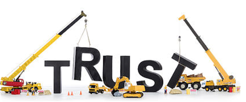
Becoming a ‘Trustable’ Organization

Old news: Having good product and service quality, at a price comparable to competitors, is enough to get into business. Having better than average product and service quality, and good experiences for customers, provides a competitive advantage. Now what? In a world in which customers all talk to each other, in which we are more interconnected than we ever imagined just a few years ago, in an age of transparency that makes keeping secrets more costly than ever before, the only sustainable competitive advantage comes from building trust-based relationships, in which customers trust us to look out for their interests proactively and reliably.
At Communica, we counsel our clients to understand that the ramifications of a trusting relationship are not limited to simply building goodwill, although that alone can be a very positive outcome. A culture and process of higher-level trust, or what Martha Rogers, Ph.D. and her partner Don Peppers call “trustability,” can benefit companies in measurable ways. According to Rogers, customers who believe a company is trustable will be more likely to:
- Pay more for certain services
- Give a company a greater share of wallet
- Provide word-of-mouth endorsement
- Require lower cost to serve
- Reduce the burden for compliance and oversight
- Follow company’s recommendations
- Forgive honest company mistakes
This culture of trust also results in an engaged workforce that takes pride in the company’s beliefs, and marketplace support that can ride the ups and downs of a volatile economy and social media swings.
But what exactly is trustability, and how is it created within an organization?
Dr. Rogers, founder of Trustability Metrix and co-author with Don Peppers of Extreme Trust: Turning Proactive Honesty and Flawless Execution into Long-Term Profits, summarizes high-level trust:
- Do things right. Invest in getting it right the first time, not wasting your customer’s time and good will, and making everything work.
- Do the right thing. Look out for your customer’s best interests as well as your own. Bring your success into alignment with the success of your customers.
- Be proactive. Remind customers. Notify them before the warranty is up. Get in front of a mistake and fix it – and apologize – before the customer even knows there’s a problem. Take the lead to make things better for your customer.
Companies that are highly trustable do what they do on purpose. Nancy Elder, vice president of communications with Jet Blue Airways, takes pride in the company’s high level of trustability: “Trustability comes from the values on which our company is built,” Elder explained. “It is the way we have established the company. At every level we have empowered our people to meet the needs of our customers.” This philosophy is ingrained throughout the organization, and results in a very personal and committed relationship with customers. Ms. Elder explains that Jet Blue was founded on one simple idea: Bring the humanity back to air travel, and that’s what their customers expect.
One thing that becomes clear is that serving customers well all the time results in what Dr. Rogers calls “trust-based loyalty.” Like other JetBlue leaders, Ms. Elder takes her turn behind the service counter at the airport, listening to customers. One very unhappy customer was really giving Ms. Elder a hard time for a travel delay. But several customers — strangers to Elder but loyal to the airline — stopped by the counter and verbally praised the airline and gave their support to Elder, making it clear that they were loyal True Blue flyers when they didn’t have to go out of their way.
Rogers points out that you can’t buy that kind of trustability. You have to earn it every day through proactive honesty and high-level competence. Elder calls it “trustproofing” the business for the future.
Communica is working with Dr. Rogers and her team at Trustability Metrix to provide our clients with general counseling and specific tools to build a trustable organization. Ask yourself: What does a trustable [your company’s name here] look like? If someone in your industry measured high-level trustability tomorrow, how would your company rank? How would you measure the three main elements of trustability? What methods would you use beyond social media “brand trust” to understand where your company needs to improve and how?
